JEJE Accounting & Consulting
Brand Design & Photography
“Jeje” - A word from the Yoruba language of Southwestern Nigeria meaning Gentle, Careful or suggesting peace and calm.
The desire at JEJE is to see businesses and business owners achieve what they set out to achieve through support, coaching, guidance and journeying together. Pelumi (Founder) aims to help his clients feel a sense of peace and calm in every aspect of the service being provided to them by the firm.
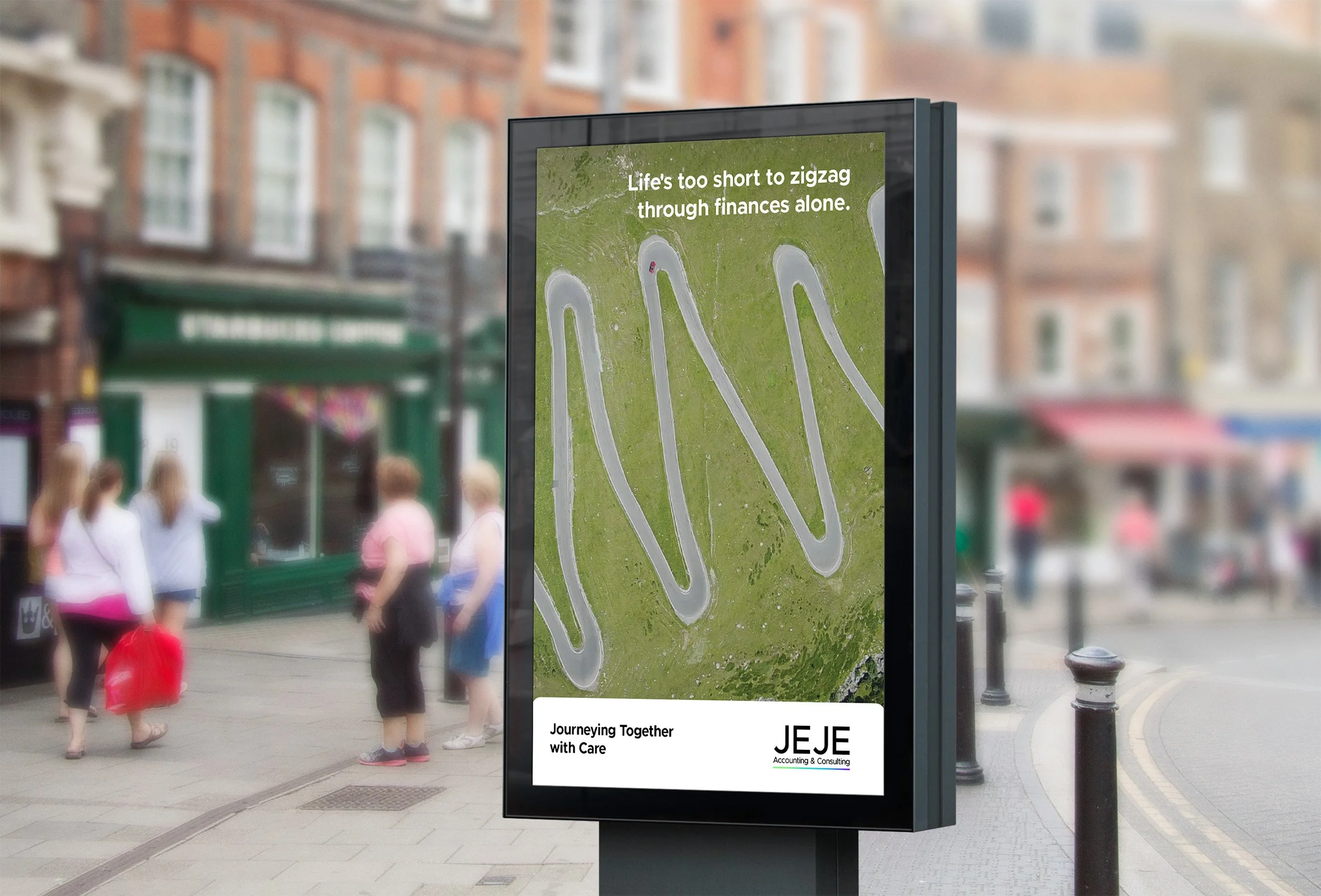
Journeying Together with Care
Logo
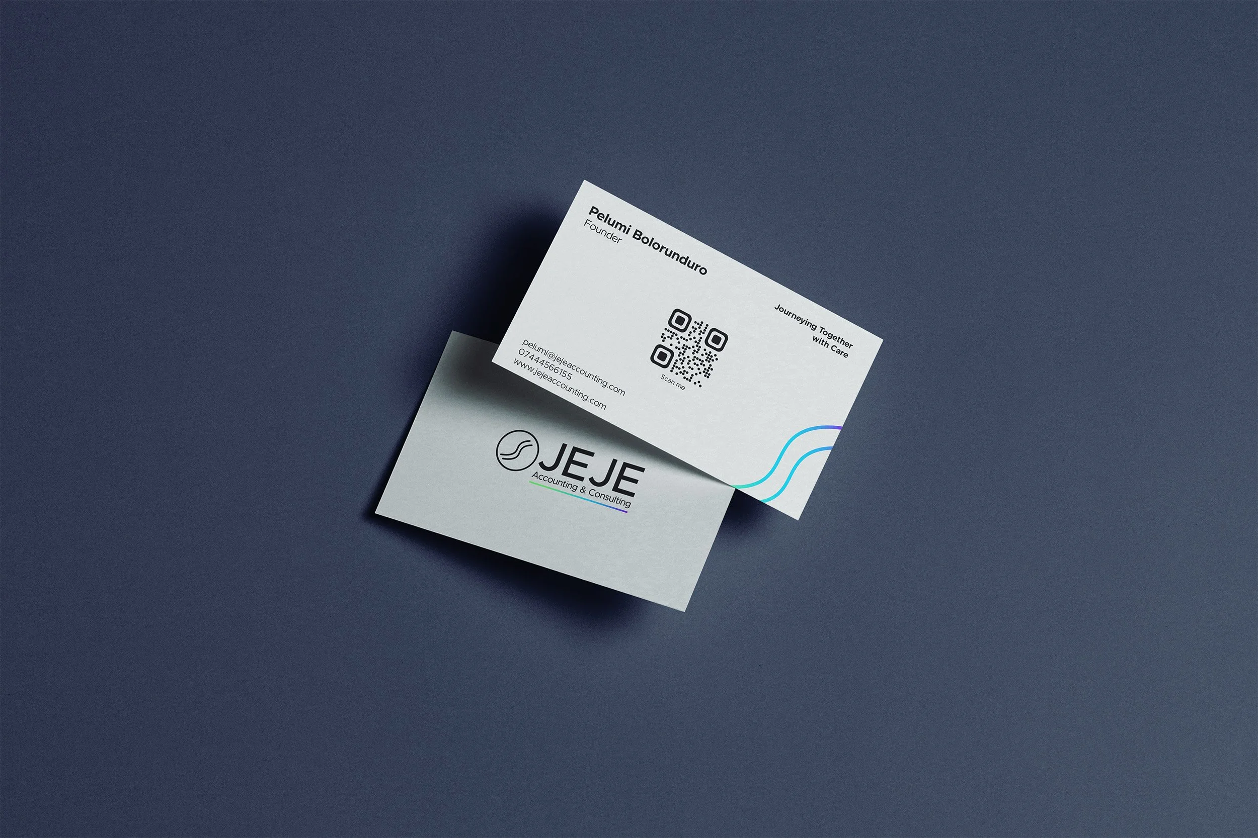
The idea of “Journeying Together” and the word “Jeje” is symbolised in the logomark by two simple curved lines. The circle represents a coin. It is simple yet effective.
Colour palette
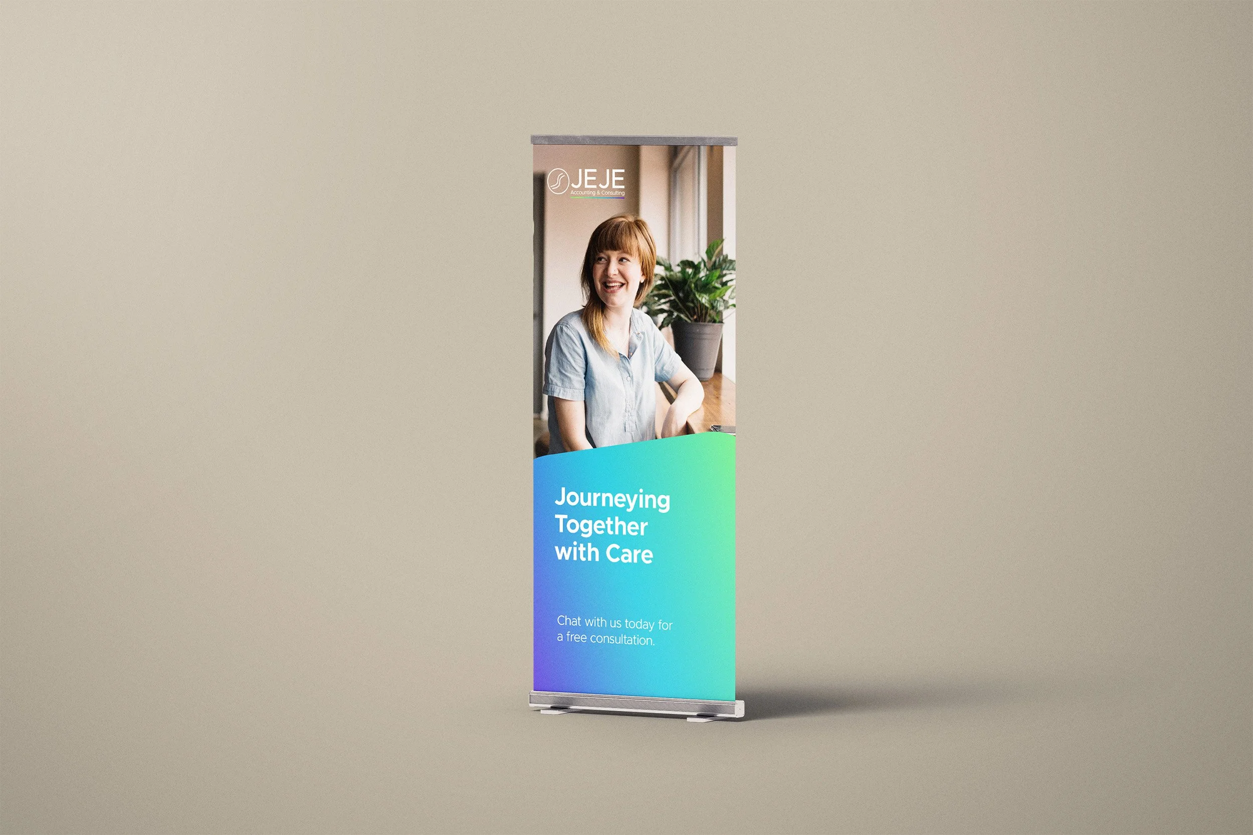
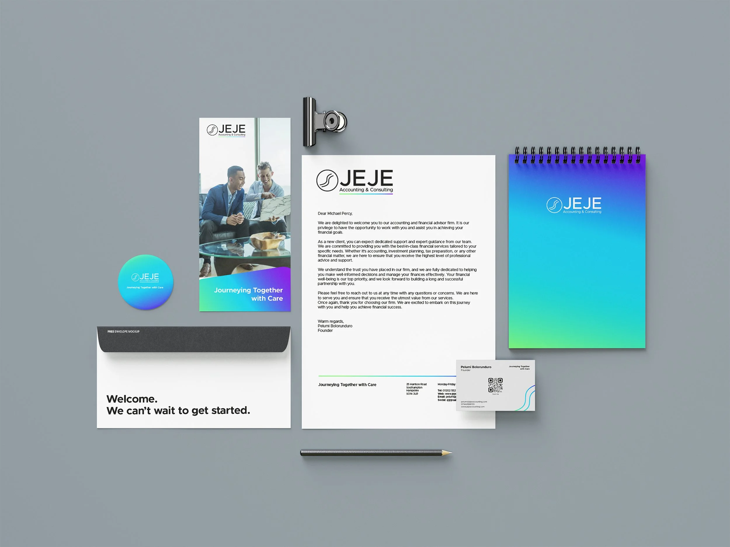
Gradients were chosen to portray one’s journey from one place to another as well as to evoke a sense of calmness. The colours were strategically chosen as green typically represent the finance sector and blue is often associated with trust, peace and stability.
Two gradients were chosen to be able to use them for each service that the firm offers, accounting and consulting.
Typography
Metropolis is a modern geometric sans-serif typeface. It features a sleek and elegant by design and is characterised by its angular strokes and rounded corners, giving it a warm yet strong appearance. This helps the brand feel professional as well as friendly.


